Infinite 3D Swiper
.gif)
Step 1: Add a container and a wrapper
Grab a div, place it in the body of your page and give it a class of swiper-container with these settings:
- Margin (Top and Bottom): 50px
- Width: 100%
- Transform settings > Distance: 1500px

Now add a div inside the container and give it a class of swiper-wrapper with these settings:
- Display > Flex, Horizontal, Align:Stretch, Justify:Start

Step 2: Create the cards
Place a div in the wrapper and give it a class of swiper-slide with these settings:
- Sizing: don't shrink or grow
- Width: 320px
- Min Width: 0px
- Overflow: hidden
- Border Radius: 10px

Add inside another div with the class picture"and t-1'with these settings:
- Width: 320px
- Height: 320px
- Overflow: hidden

Now set as a background your picture and give it the following settings:
- Size: Cover
- Position: Center
- Tile: Don't tile
- Not fixer

Duplicate the div swiper-slide inside the swiper-wrapper for every card you want to create.
⚠️ Every time you duplicate this div, change the picture 's combo class from t-1 to t-2 and so one.
Step 3: Add the custom code
We’ve created all the elements we need, so now we can add the actual functionality through the JavaScript code snippet.
Our custom code will live both inside <head> tag and before </body> tag.
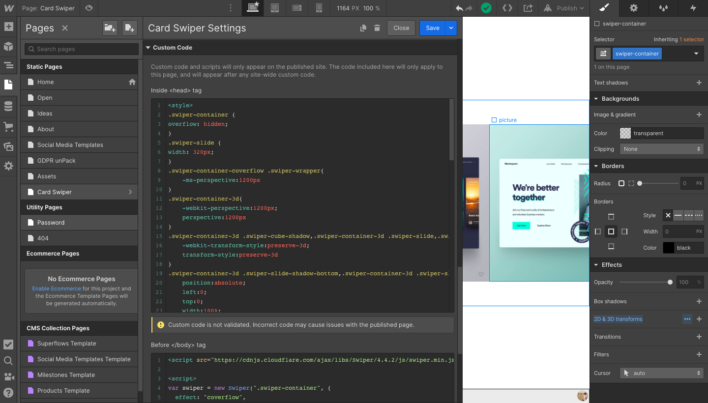
in the inside <head> custom code section of the page, add this code:
<style>
.swiper-container {
overflow: hidden;
}
.swiper-slide {
width: 320px;
}
.swiper-container-coverflow .swiper-wrapper{
-ms-perspective:1200px
}
.swiper-container-3d{
-webkit-perspective:1200px;
perspective:1200px
}
.swiper-container-3d .swiper-cube-shadow,.swiper-container-3d .swiper-slide,.swiper-container-3d .swiper-slide-shadow-bottom,.swiper-container-3d .swiper-slide-shadow-left,.swiper-container-3d .swiper-slide-shadow-right,.swiper-container-3d .swiper-slide-shadow-top,.swiper-container-3d .swiper-wrapper{
-webkit-transform-style:preserve-3d;
transform-style:preserve-3d
}
.swiper-container-3d .swiper-slide-shadow-bottom,.swiper-container-3d .swiper-slide-shadow-left,.swiper-container-3d .swiper-slide-shadow-right,.swiper-container-3d .swiper-slide-shadow-top{
position:absolute;
left:0;
top:0;
width:100%;
height:100%;
pointer-events:none;
z-index:10
}
.swiper-container-3d .swiper-slide-shadow-left{
background-image:-webkit-gradient(linear,right top,left top,from(rgba(0,0,0,.5)),to(rgba(0,0,0,0)));
background-image:-webkit-linear-gradient(right,rgba(0,0,0,.5),rgba(0,0,0,0));
background-image:-o-linear-gradient(right,rgba(0,0,0,.5),rgba(0,0,0,0));
background-image:linear-gradient(to left,rgba(0,0,0,.5),rgba(0,0,0,0))
}
.swiper-container-3d .swiper-slide-shadow-right{
background-image:-webkit-gradient(linear,left top,right top,from(rgba(0,0,0,.5)),to(rgba(0,0,0,0)));
background-image:-webkit-linear-gradient(left,rgba(0,0,0,.5),rgba(0,0,0,0));
background-image:-o-linear-gradient(left,rgba(0,0,0,.5),rgba(0,0,0,0));
background-image:linear-gradient(to right,rgba(0,0,0,.5),rgba(0,0,0,0))
}
.swiper-container-3d .swiper-slide-shadow-top{
background-image:-webkit-gradient(linear,left bottom,left top,from(rgba(0,0,0,.5)),to(rgba(0,0,0,0)));
background-image:-webkit-linear-gradient(bottom,rgba(0,0,0,.5),rgba(0,0,0,0));
background-image:-o-linear-gradient(bottom,rgba(0,0,0,.5),rgba(0,0,0,0));
background-image:linear-gradient(to top,rgba(0,0,0,.5),rgba(0,0,0,0))
}
.swiper-container-3d .swiper-slide-shadow-bottom{
background-image:-webkit-gradient(linear,left top,left bottom,from(rgba(0,0,0,.5)),to(rgba(0,0,0,0)));
background-image:-webkit-linear-gradient(top,rgba(0,0,0,.5),rgba(0,0,0,0));
background-image:-o-linear-gradient(top,rgba(0,0,0,.5),rgba(0,0,0,0));
background-image:linear-gradient(to bottom,rgba(0,0,0,.5),rgba(0,0,0,0))
}
.swiper-container-horizontal>.swiper-pagination-bullets,.swiper-pagination-custom,.swiper-pagination-fraction{
bottom:10px;
left:0;
width:100%
}
.swiper-container-horizontal>.swiper-pagination-bullets.swiper-pagination-bullets-dynamic{
left:50%;
-webkit-transform:translateX(-50%);
-ms-transform:translateX(-50%);
transform:translateX(-50%);
white-space:nowrap
}
.swiper-container-horizontal>.swiper-pagination-bullets.swiper-pagination-bullets-dynamic .swiper-pagination-bullet{
-webkit-transition:.2s left,.2s -webkit-transform;
transition:.2s left,.2s -webkit-transform;
-o-transition:.2s transform,.2s left;
transition:.2s transform,.2s left;
transition:.2s transform,.2s left,.2s -webkit-transform
}
.swiper-container-horizontal.swiper-container-rtl>.swiper-pagination-bullets-dynamic .swiper-pagination-bullet{
-webkit-transition:.2s right,.2s -webkit-transform;
transition:.2s right,.2s -webkit-transform;
-o-transition:.2s transform,.2s right;
transition:.2s transform,.2s right;
transition:.2s transform,.2s right,.2s -webkit-transform
}
</style>
Then, in the before </body> custom code section of the page, you’ll add this script:
<script src="https://cdnjs.cloudflare.com/ajax/libs/Swiper/4.4.2/js/swiper.min.js"></script><script>
var swiper = new Swiper(".swiper-container", {
effect: "coverflow",
grabCursor: true,
centeredSlides: true,
slidesPerView: "auto",
coverflowEffect: {
rotate: 20,
stretch: 0,
depth: 350,
modifier: 1,
slideShadows: true
}
});
</script>
That’s it! Now publish your website and enjoy the results.
Step 4: Customize your swiper
At this point, your slider should look like this:

You can customize how your swiper works by adding a few lines of code.

Start from the middle: If you want it to start from the middle instead of from the first card, insert the following line in Before </body> tag
initialSlide: 3,
(Increase that number if you add more cards in your slider).

Loop : if you want to enable continuous loop mode, insert the following line in Before </body> tag
loop: true,

Click to slide: if you want to click on any slide to produce a transition to this slide, insert the following line in Before </body> tag
slideToClickedSlide: true,
👉 Visit swiper.js's API documentation to discover all the available customizations